Theme Configuration
The theme is configured with the theme.config.jsx file. It should export an object that contains your configurations, for example:
export default {
  project: {
    link: 'https://github.com/shuding/nextra'
  },
  logo: <b>Project</b>
}
Detailed information for each option is listed below.
Global
Docs Repository
Set the repository URL of the documentation. It’s used to generate the “Edit this page” link and the “Feedback” link.
| Option | Type | Description |
|---|---|---|
| docsRepositoryBase | string | URL of the documentation repository. |
Specify a Path
If the documentation is inside a monorepo, a subfolder, or a different branch of
the repository, you can simply set the docsRepositoryBase to the root path of
the pages/ folder of your docs. For example:
export default {
  docsRepositoryBase: 'https://github.com/shuding/nextra/tree/main/docs'
}
Then Nextra will automatically generate the correct file path for all pages.
SEO Options
You can configure SEO related settings via the useNextSeoProps option. The
useNextSeoProps function returns the props that will be passed to the
Next SEO (opens in a new tab) component.
It is also a hook, so you can use APIs like useRouter inside to return values
conditionally.
| Option | Type | Description |
|---|---|---|
| useNextSeoProps | () => NextSeoProps | A React hook function that returns options for Next SEO. |
For example, we can have all pages rendering the same suffix for <title>:
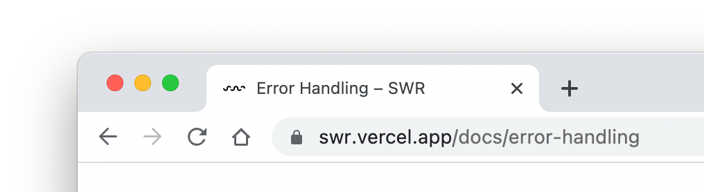
export default {
  useNextSeoProps() {
    return {
      titleTemplate: '%s – SWR'
    }
  }
}
The %s is a placeholder (opens in a new tab)
that will be replaced by the page title.
You can also return it conditionally to avoid adding the suffix to the homepage:
import { useRouter } from 'next/router'

export default {
  useNextSeoProps() {
    const { asPath } = useRouter()
    if (asPath !== '/') {
      return {
        titleTemplate: '%s – SWR'
      }
    }
  }
}
Head Tags
Configure the <head> tags of the website. You can add meta tags, title,
favicon, etc.
| Option | Type | Description |
|---|---|---|
| head | React.ReactNode | React.FC | Component that renders the <head> content. |
Static Head Tags
If you have only static head tags, it’s easy to directly put them in head. For
example:
export default {
  head: (
    <>
      <meta name="viewport" content="width=device-width, initial-scale=1.0" />
      <meta property="og:title" content="Nextra" />
      <meta property="og:description" content="The next site builder" />
    </>
  )
}
Dynamic Tags Based on Page
You can also use a function component as head to dynamically generate the
head tags based on the current page’s front matter. For example:
import { useRouter } from 'next/router'
import { useConfig } from 'nextra-theme-docs'

export default {
  head: () => {
    const { asPath, defaultLocale, locale } = useRouter()
    const { frontMatter } = useConfig()
    const url =
      'https://my-app.com' +
      (defaultLocale === locale ? asPath : `/${locale}${asPath}`)

    return (
      <>
        <meta property="og:url" content={url} />
        <meta property="og:title" content={frontMatter.title || 'Nextra'} />
        <meta
          property="og:description"
          content={frontMatter.description || 'The next site builder'}
        />
      </>
    )
  }
}
You can refer to the useConfig API section
for more information about the useConfig hook and the frontMatter object.
Dark Mode and Themes
Customize the theme behavior of the website.
| Option | Type | Description |
|---|---|---|
| darkMode | boolean | Show or hide the dark mode toggle button. |
| nextThemes | object | Configuration for the next-themes (opens in a new tab) package. |
Theme Color
You can adjust the theme color of the website by setting primary hue and saturation values for light and dark themes.
| Option | Type | Description |
|---|---|---|
| primaryHue | number | { dark: number; light: number } | The hue of the primary theme color. |
| primarySaturation | number | { dark: number; light: number } | The saturation of the primary theme color. |
Try it out for this website:
| Hue | Saturation |
|---|---|
| |
Navbar
Logo
The logo of the website rendered on the navbar. It can be a React node or a function component.
| Option | Type | Description |
|---|---|---|
| logo | React.ReactNode | React.FC | Logo of the website. |
| logoLink | boolean | string | Link of the logo. |
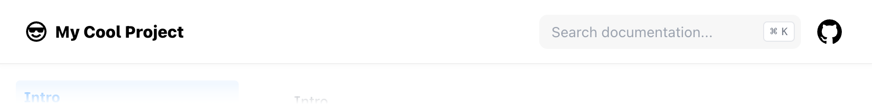
export default {
  logo: (
    <>
      <svg width="24" height="24" viewBox="0 0 24 24">
        <path
          fill="currentColor"
          d="M14.683 14.828a4.055 4.055 0 0 1-1.272.858a4.002 4.002 0 0 1-4.875-1.45l-1.658 1.119a6.063 6.063 0 0 0 1.621 1.62a5.963 5.963 0 0 0 2.148.903a6.035 6.035 0 0 0 3.542-.35a6.048 6.048 0 0 0 1.907-1.284c.272-.271.52-.571.734-.889l-1.658-1.119a4.147 4.147 0 0 1-.489.592z M12 2C6.486 2 2 6.486 2 12s4.486 10 10 10s10-4.486 10-10S17.514 2 12 2zm0 2c2.953 0 5.531 1.613 6.918 4H5.082C6.469 5.613 9.047 4 12 4zm0 16c-4.411 0-8-3.589-8-8c0-.691.098-1.359.264-2H5v1a2 2 0 0 0 2 2h2a2 2 0 0 0 2-2h2a2 2 0 0 0 2 2h2a2 2 0 0 0 2-2v-1h.736c.166.641.264 1.309.264 2c0 4.411-3.589 8-8 8z"
        />
      </svg>
      <span style={{ marginLeft: '.4em', fontWeight: 800 }}>
        My Cool Project
      </span>
    </>
  )
}
Project Link
Show a button that links to your project’s homepage on the navbar. By default, it links to Nextra’s GitHub repository.
| Option | Type | Description |
|---|---|---|
| project.link | string | URL of the project homepage. |
| project.icon | React.ReactNode | React.FC | Icon or element of the project link. |
You can configure project.link and project.icon to customize the project
link, for example make it link to your GitLab repository:
export default {
  project: {
    link: 'https://gitlab.com/inkscape/inkscape',
    icon: (
      <svg width="24" height="24" viewBox="0 0 256 256">
        <path
          fill="currentColor"
          d="m231.9 169.8l-94.8 65.6a15.7 15.7 0 0 1-18.2 0l-94.8-65.6a16.1 16.1 0 0 1-6.4-17.3L45 50a12 12 0 0 1 22.9-1.1L88.5 104h79l20.6-55.1A12 12 0 0 1 211 50l27.3 102.5a16.1 16.1 0 0 1-6.4 17.3Z"
        ></path>
      </svg>
    )
  }
}
If icon is missing, it will be a
GitHub icon (opens in a new tab) by default.
Chat Link
Show a button that links to your project’s forum or other social media on the navbar.
| Option | Type | Description |
|---|---|---|
| chat.link | string | URL of the chat link. |
| chat.icon | React.ReactNode | React.FC | Icon or element of the chat link. |
You can configure chat.link and chat.icon to customize the chat link, for
example make it link to your Twitter account:
export default {
  chat: {
    link: 'https://twitter.com/shuding_',
    icon: (
      <svg width="24" height="24" viewBox="0 0 248 204">
        <path
          fill="currentColor"
          d="M221.95 51.29c.15 2.17.15 4.34.15 6.53 0 66.73-50.8 143.69-143.69 143.69v-.04c-27.44.04-54.31-7.82-77.41-22.64 3.99.48 8 .72 12.02.73 22.74.02 44.83-7.61 62.72-21.66-21.61-.41-40.56-14.5-47.18-35.07a50.338 50.338 0 0 0 22.8-.87C27.8 117.2 10.85 96.5 10.85 72.46v-.64a50.18 50.18 0 0 0 22.92 6.32C11.58 63.31 4.74 33.79 18.14 10.71a143.333 143.333 0 0 0 104.08 52.76 50.532 50.532 0 0 1 14.61-48.25c20.34-19.12 52.33-18.14 71.45 2.19 11.31-2.23 22.15-6.38 32.07-12.26a50.69 50.69 0 0 1-22.2 27.93c10.01-1.18 19.79-3.86 29-7.95a102.594 102.594 0 0 1-25.2 26.16z"
        />
      </svg>
    )
  }
}
If icon is missing, it will be a Discord icon by default.
Menu and Custom Links
Check out Page Configuration to learn how to add custom menus or links to the navbar.
Search
| Option | Type | Description |
|---|---|---|
| search.component | React.ReactNode | React.FC<{ className?: string directories: Item[] }> | |
| search.emptyResult | React.ReactNode | React.FC | Not found text |
| search.loading | React.ReactNode | React.FC | Loading text |
| search.error | string | (() => string) | Error text |
| search.placeholder | string | (() => string) | Placeholder text |
Banner
Show a banner on the top of the website. It can be used to show a warning or a notice.
| Option | Type | Description |
|---|---|---|
| banner.dismissible | boolean | Closable banner or not. |
| banner.key | string | Storage key to keep the banner state (dismissed or not). |
| banner.text | React.ReactNode | React.FC | Text of the banner. |
Banner key
A banner can be dismissed. By default banner.key will be "nextra-banner" and
it’s used by
localStorage (opens in a new tab)
to keep the banner state (dismissed or not) on the client.
If you have updated your banner text, you should change the key to make sure the banner is shown again. The best practice is to always use a descriptive key for the current text, for example:
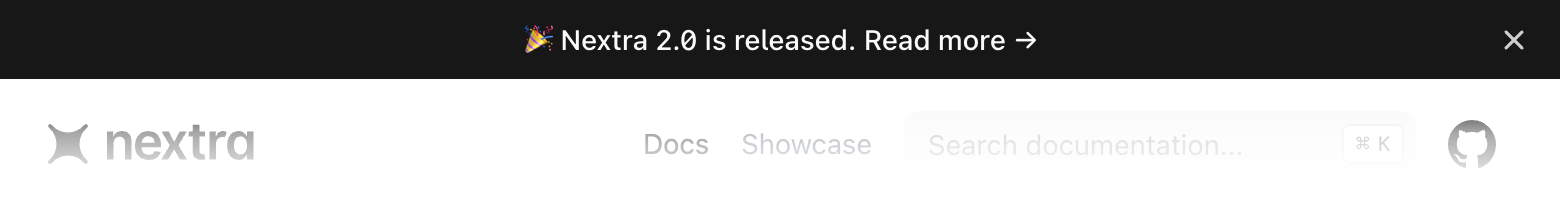
export default {
  banner: {
    key: '2.0-release',
    text: (
      <a href="https://nextra.site" target="_blank">
        🎉 Nextra 2.0 is released. Read more →
      </a>
    )
  }
}
Customize the Navbar
Customize the entire navbar component.
| Option | Type | Description |
|---|---|---|
| navbar.component | React.ReactNode | React.FC<NavBarProps> | Navbar component. |
| navbar.extraContent | React.ReactNode | React.FC | Display extra content after last icon. |
Sidebar
| Option | Type | Description |
|---|---|---|
| sidebar.defaultMenuCollapseLevel | number | Specifies the folder level at which the menu on the left is collapsed by default. Defaults to 2. |
| sidebar.autoCollapse | boolean | If true, automatically collapse inactive folders above defaultMenuCollapseLevel. |
| sidebar.titleComponent | React.ReactNode | React.FC<{ type: string; title: string; route: string; }> | Custom renderer for sidebar titles. |
| sidebar.toggleButton | boolean | Hide/show sidebar toggle button. Defaults to `false`. |
Menu Collapse Level
By default, the sidebar menu is collapsed at level 2. You can change it by
setting sidebar.defaultMenuCollapseLevel to a different number. For example,
when set to 1, every folder will be collapsed by default and when set to
Infinity, all nested folders will be expanded by default.
If sidebar.autoCollapse is set to true, then all folders that do not contain
an active/focused route will automatically collapse up to the level set by
sidebar.defaultMenuCollapseLevel. e.g. if defaultMenuCollapseLevel is 2,
then top-level folders will not auto-collapse.
Customize Sidebar Content
Together with the Separators
item, you can customize how the sidebar content is rendered by using the
sidebar.titleComponent option:
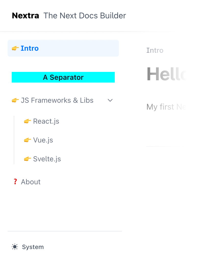
export default {
  sidebar: {
    titleComponent({ title, type }) {
      if (type === 'separator') {
        return (
          <div style={{ background: 'cyan', textAlign: 'center' }}>{title}</div>
        )
      }
      if (title === 'About') {
        return <>❓ {title}</>
      }
      return <>👉 {title}</>
    }
  }
}
Content
MDX Components
Provide custom MDX components (opens in a new tab) to
render the content. For example, you can use a custom pre component to render
code blocks.
| Option | Type | Description |
|---|---|---|
| components | Record<string, React.FC> | Custom MDX components. |
Writing Direction
The default writing direction of the website.
| Option | Type | Description |
|---|---|---|
| direction | "ltr" | "rtl" | Default writing direction. |
Main Content
Render top and/or bottom content of main area of the page. It can be used to render a comment section, a newsletter form, or any other type of content.
| Option | Type | Description |
|---|---|---|
| main | React.FC<{ children: React.ReactNode }> | Component of main content. |
TOC Sidebar
Table of Contents
Show a table of contents on the right side of the page. It’s useful for navigating between headings.
| Option | Type | Description |
|---|---|---|
| toc.component | React.ReactNode | React.FC<TOCProps> | Custom renderer of the TOC. |
| toc.extraContent | React.ReactNode | React.FC | Display extra content below the TOC content. |
| toc.float | boolean | Float the TOC next to the content. |
| toc.title | React.ReactNode | React.FC | Title of the TOC sidebar. By default it’s “On This Page”. |
| toc.headingComponent | React.FC<{ id: string, children: string }> | Custom renderer of TOC headings. |
| toc.backToTop | boolean | Add `Scroll to top` link. |
Floating TOC
toc.float is enabled by default. When enabled, the TOC will be displayed on
the right side of the page and it will be sticky when scrolling. If it’s
disabled, the TOC will be displayed directly on the page sidebar.
Edit Link
Show an “Edit this page” link on the page that points to the file URL on GitHub (or other places).
| Option | Type | Description |
|---|---|---|
| editLink.text | React.ReactNode | React.FC | Content of the default edit link. |
| editLink.component | React.FC<{ children: React.ReactNode className?: string filePath?: string }> | null | Customized edit link component. |
To disable it, you can set editLink.component to null.
Feedback Link
The built-in feedback link provides a way for users to submit feedback about the documentation. By default, it’s a link that points to the issue creation form of the docs repository, with the current website title prefilled: example (opens in a new tab).
| Option | Type | Description |
|---|---|---|
| feedback.content | React.ReactNode | React.FC | Content of the feedback button. |
| feedback.labels | string | Labels that can be added to the new created GitHub issue. |
| feedback.useLink | () => string | Custom link, by default, will open an issue in the repository set in `docsRepositoryBase`. |
To disable it, you can set feedback.content to null.
End of Page
Navigation
Show previous and next page links on the bottom of the content. It’s useful for navigating between pages.
| Option | Type | Description |
|---|---|---|
| navigation | boolean | object | Enable or disable navigation link. |
| navigation.prev | boolean | Enable or disable the previous page link. |
| navigation.next | boolean | Enable or disable the next page link. |
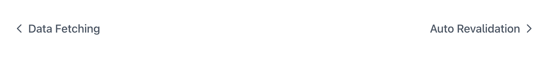
export default {
  navigation: {
    prev: true,
    next: true
  }
}
The above is also equivalent to navigation: true.
Last Updated Date
Show the last updated date of each page. It’s useful for showing the freshness of the content.
| Option | Type | Description |
|---|---|---|
| gitTimestamp | React.ReactNode | React.FC<{ timestamp: Date }> | Component to render the last updated info. |
Footer
The footer area of the website. You can either specify some content for the default footer, or fully customize it with a custom component.
| Option | Type | Description |
|---|---|---|
| footer.text | React.ReactNode | React.FC | Content of the default footer component. |
| footer.component | React.ReactNode | React.FC<{ menu: boolean }> | Customized footer component. |
Copyright Information
You can add some simple content, such as copyright information to the default footer:
export default {
  footer: {
    text: (
      <span>
        MIT {new Date().getFullYear()} ©{' '}
        <a href="https://nextra.site" target="_blank">
          Nextra
        </a>
        .
      </span>
    )
  }
}
Theme Switch
| Option | Type | Description |
|---|---|---|
| themeSwitch.component | React.ReactNode | React.FC<{ lite?: boolean, className?: string }> | Component to render the theme switch. |
| themeSwitch.useOptions | ThemeOptions | () => ThemeOptions | Options in the theme switch. |
Options
You are able to customize the option names for localization or other purposes:
export default {
  themeSwitch: {
    useOptions() {
      return {
        light: 'Light',
        dark: 'Dark',
        system: 'System'
      }
    }
  }
}
Error Pages
404 - Not Found
500 - Internal Server Error
Favicon Glyph (Experimental)
This isn’t supported by all browsers, but it’s a nice way to customize the favicon of the website simply by using an emoji or character.
| Option | Type | Description |
|---|---|---|
| faviconGlyph | string | The glyph to use as the favicon. |